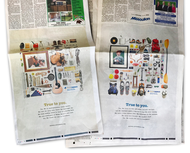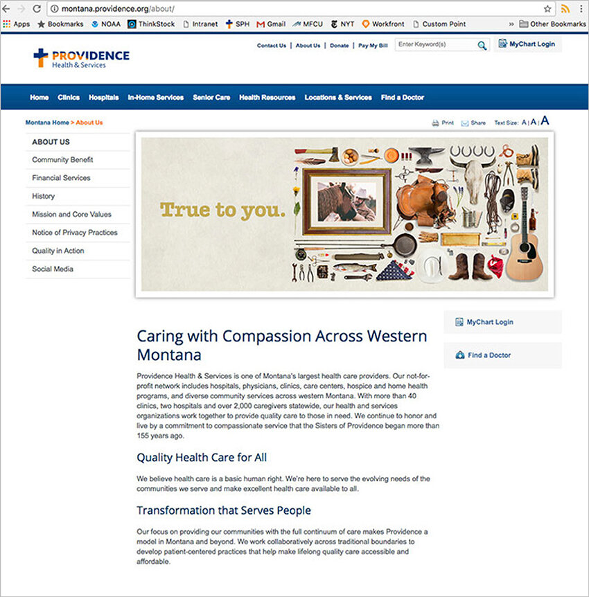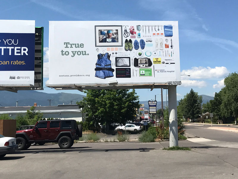
True to You
Graphic Design
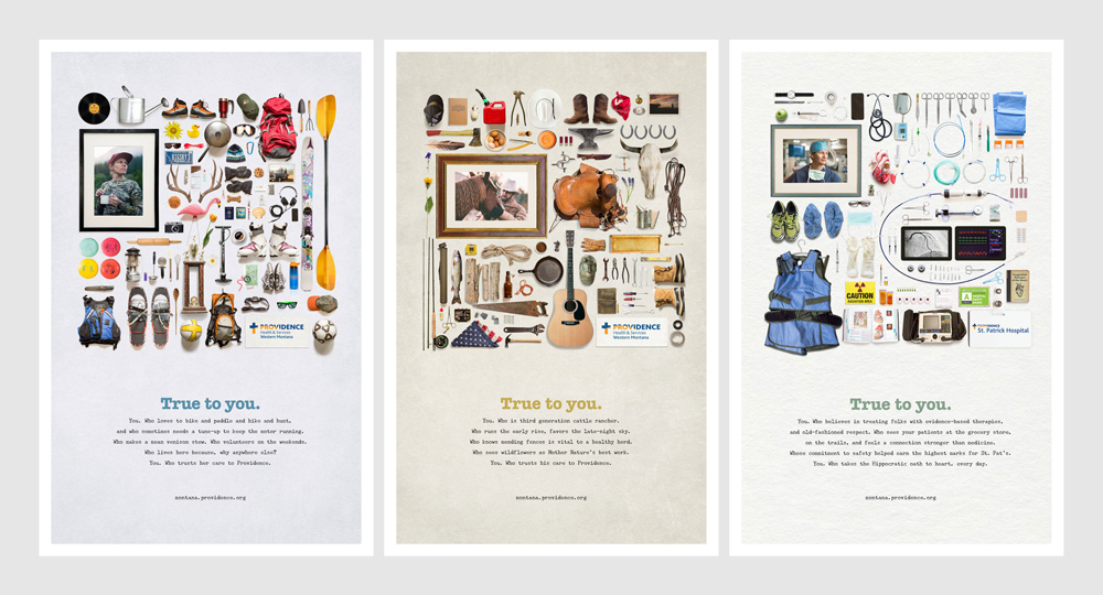
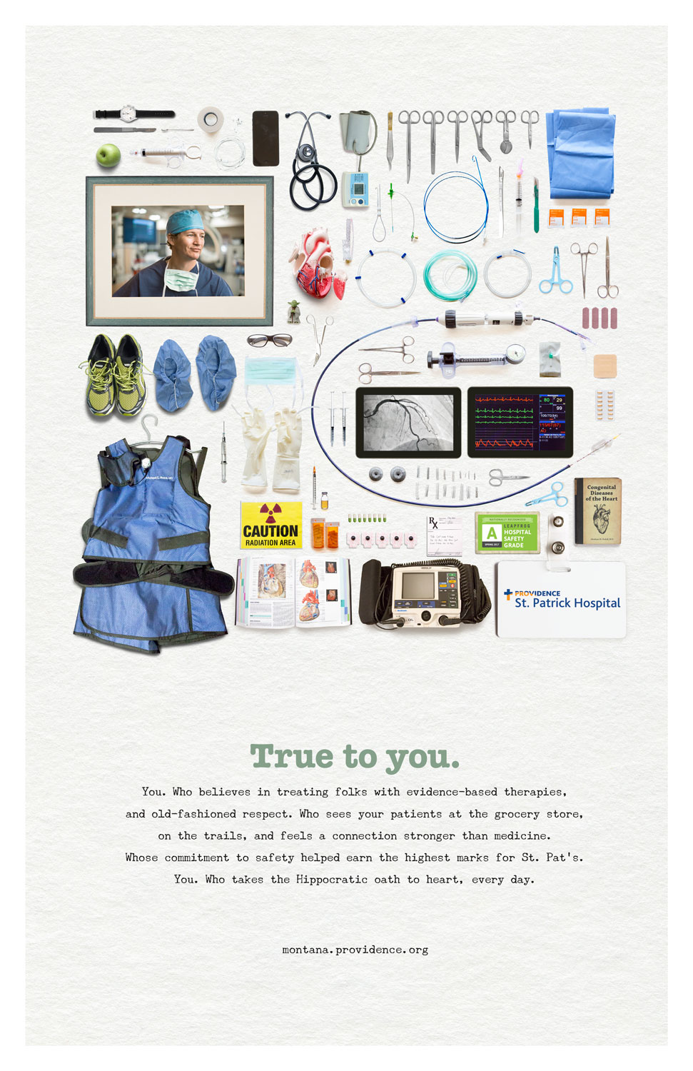
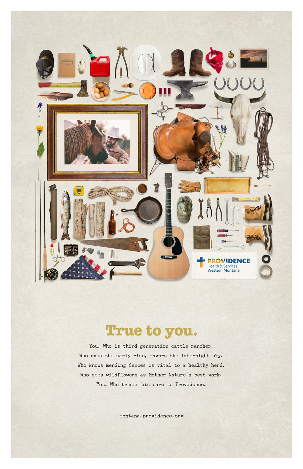
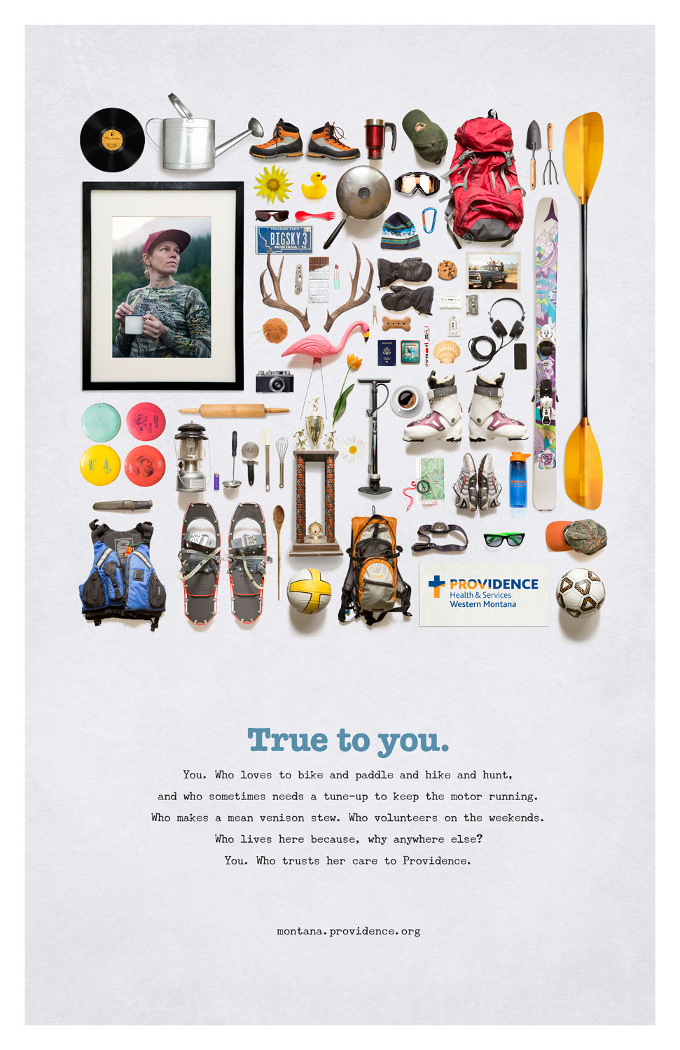
In the tight-knit community of Missoula, Montanans were looking for reassurance that Providence—a growing West Coast hospital system—still had the back of its small but mighty community hospitals. And so True to You was born - a love letter to the people of the community, the lifeblood of Montana and its unique culture. Using a technique known as knolling, I developed three character profiles told through lifestyle items. Among the items that define each character visually is the Providence logo—meant to convey that Providence, too, is a part of who folks are as western Montanans.
